A Conversation with Max Mahn
by Miles Jochem
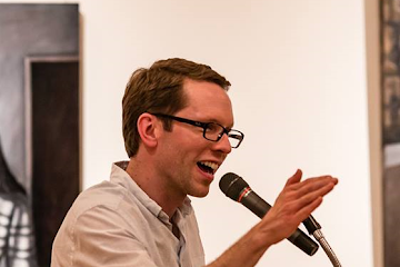
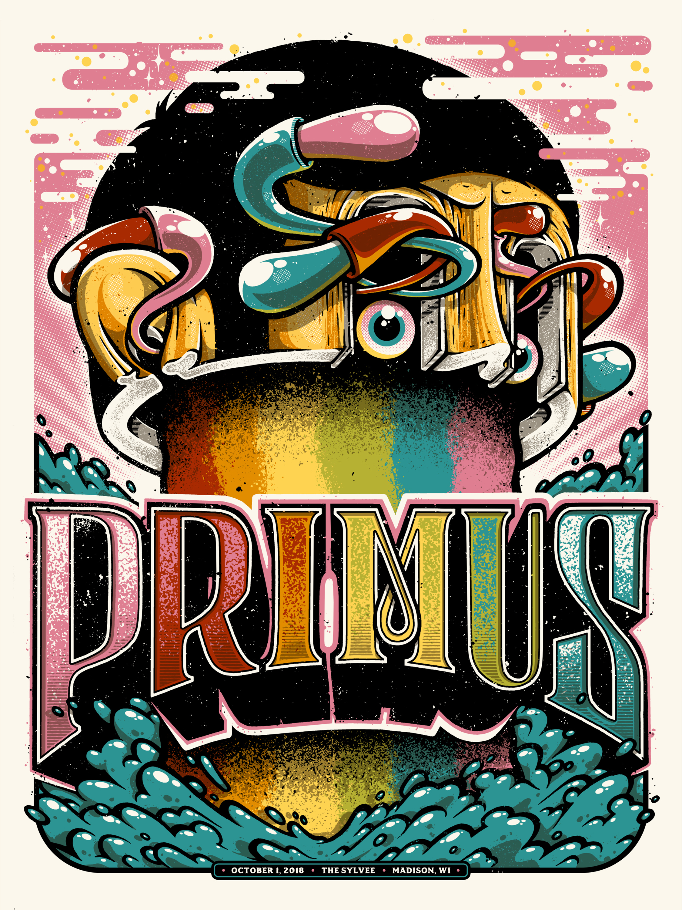
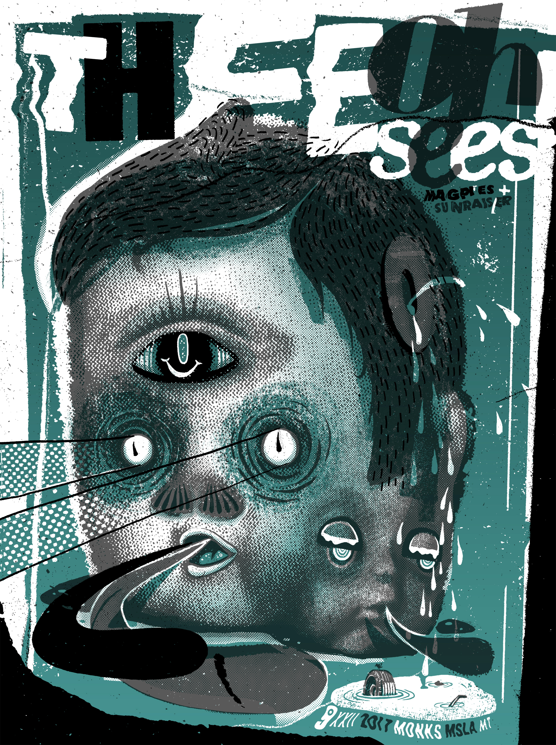
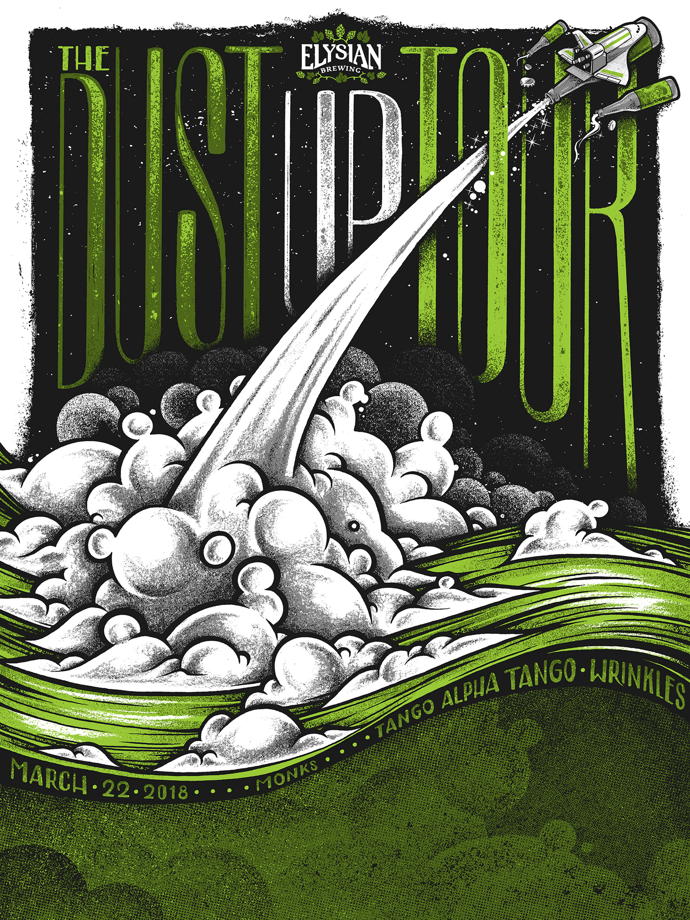
I sat down with Max Mahn, founder of Twin Home Prints, for a conversation about art and working in a creative industry. Mahn received his BFA from the University of Montana and now runs a small business making gig posters for touring musicians, as well as artwork for events and organizations such as KBGA and the Montana Book Festival. Mahn’s work is detailed and complex, and it draws on traditions as diverse as graffiti, cartoons, graphic novels, commercial illustration, and (in a skeptical and irreverent fashion) fine art. He had a lot to say about creative careers, the relative value of academic and industry education, and Banksy’s self-destructing painting.
Miles Jochem: Are you from Missoula, originally?
Max Mahn: Yep, born and raised. But I recently moved down to Wyoming. My girlfriend is going to nursing school down there. She’s from there, with in-state tuition and cheap school, so, you know…
MJ: Yeah, why not? In Powell, right?
MM: Yeah, right outside of Cody.
MJ: Cool. Well, here’s my first question: In an interview with JustPrintmaking.com in May, you mentioned that you were about to quit your day job and go into business full-time as an artist and freelancer.
MM: That happened!
MJ: You made a joke in the interview: “Check back in a few months and see what restaurant I’m working in.”
MM: Luckily, I haven’t even had to apply to a restaurant. It’s worked out pretty good. The expenses are really cheap in Wyoming, which has helped out, but also I’ve been super busy; a lot busier than I thought I would be. I think I was just scared in the first part of finally doing it because if it didn’t happen, it would be like the thing I wanted to do with my life didn’t work out. But I finally bit the bullet and it’s working out, at least so far.
MJ: That’s awesome! I want to talk about your aesthetics a little bit. In the previous interview, you mentioned that you don’t see yourself as a traditional fine artist?
MM: Yeah.
MJ: I’m curious about the distinction that you make between what you do and “fine art,” especially given the fact that you have a university art degree. Also, the other thing I’m considering is that artists who work in more “popular” or graffiti-influenced styles have been getting a lot of traction in traditional art places like Sotheby’s or big museums. So I’m just wondering about why you see yourself as belonging to a separate tradition?
MM: Well, I did graffiti for about twelve years, so I learned a lot of my style from that, and it’s not a “strict” art form. I was taught in school that form follows content. That it’s about what your work means and your form will follow that. What you’re trying to say to people has to have some point or concept that you are trying to convey, some opinion, which I was always really bad at. I guess I’m more of an illustrator. I like there to be a story. It doesn’t have to be some specific thing to push on the viewer. I’m okay with whatever people want to take from it and I like to just be goofy and have fun. But you bring up a good point with street art or graffiti popping into the fine art world, and there’s always that gray area of whether it’s accepted or not, whether it should even be on gallery walls. So I guess, everything I had hammered into my head by the fine art world I have disagreed with: for example, that no one can tell you what to do, this idea of prestige. I take clients’ ideas, I collaborate with people. It’s lowbrow art in a way. I sell a poster for twenty bucks. I don’t want someone to have to have five thousand dollars to buy one of my pieces.
MJ: That’s the beauty of printmaking, right? You can make an edition instead of a single piece.
MM: Yeah, and I want it to be accessible to everybody. I don’t think my art should be something you critique all that hard.
MJ: So you shy away from, maybe, the pretention of fine art?
MM: Yeah.
MJ: Maybe the distinction is less of a visual aesthetic than a mindset?
MM: Yeah, and maybe it’s not even pretention because I don’t dislike fine art. I enjoy fine art. I know what they’re doing. I understand what they’re doing, but with what I create I have a different mindset completely, as I think a lot of graphic designers and illustrators do.
MJ: That was sort of my next question: do you think your mindset is related to the fact that most of your work has a commercial element to it, that someone else is contracting you to do a job, and you’re working within that parameter?
MM: I would say no, mainly because I create art prints as well that are in the same imagery field. I just like creating them. It’s kind of a bonus when you get to work with one of your favorite bands, because the feeling is “I can’t believe I’m doing this, this is amazing!” I would say, for pretty much anything I do, I don’t have that in mind. It is definitely commercial merchandise that I’m selling, but even my art prints I try to keep at a low price and not take too seriously.
MJ: I noticed your first professional gig was Shannon and the Clams, right?
MM: Um, professional in a way. I didn’t get paid, but it was the first time I was actually making a poster for a band that existed in the world. My first paid thing was for Yonder Mountain String Band.
MJ: Cool. I love Shannon. She’s an amazing vocalist.
MM: Yeah, they’re awesome.
MJ: Sort of related to that, I wanted to ask you: Banksy’s self-destructing painting: silly publicity stunt or profound commentary?
MM: There are so many aspects of it that I like and I hate... I don’t know. Banksy is...
MJ: He’s one of the artists who has bridged the gap between graffiti and the fine art world.
MM: I hate saying this in an interview, but I am not the biggest Banksy fan. He makes street art, and he does that very well. I don’t understand why his street art is the street art that made it into museums and made him very popular. Just because I think his imagery is very cliché a lot of the time. You know, there’s not too much thought put into it. Which is what I like, and that’s great, but I don’t think that belongs in a fine art gallery. But maybe I’m talking myself down now though, I don’t know.
MJ: Does your art belong in a fine art gallery?
MM: No! Not at all.
MJ: Have you ever exhibited in a gallery before?
MM: Yeah. I mean, through school you’re always asked to submit to auctions and stuff like that. It just never felt like the right place. You know, people dressed up really nice and looking at my weird cartoon people with, like, weird noses and heads cut in half. It doesn’t feel right. However, the [Banksy] cutting piece, I thought was really cool. I had a professor in college who did the exact same thing, though, five years ago. So I just assume Banksy is copying artists in Missoula (laughter).
MJ: That’s a bold claim! You had a professor who had a self-destructing piece of art?
MM: Jack Metcalf, for his MFA show, had this big elaborate walk through place at the Crystal Theater, which is now that Gild Brewery, and the final length of the walkthrough was this private room that you go in and he had this giant drawing and he had this machine which was cutting it. It was a crazy machine. It would make one cut and then it would kind of scroll down like an inch, and then it would cut. For the entire show it was destroying this huge drawing that he did.
MJ: Wow, that’s almost like a performance, then. Is he still a professor?
MM: He’s an adjunct, I think. At that time he was doing his masters, but he taught classes. But I like the idea of destroying something. That’s really funny to me, especially when someone is spending that much money.
MJ: Twenty million dollars or something like that.
MM: Yeah, and I think it backfired on [Bansky], just because it’s got to be worth more now.
MJ: It didn’t have the intended effect?
MM: Yeah, but I know that’s not what he, or she or they or whatever Banksy is, was going for. So I appreciate that. I appreciate everything that Banksy does. It’s just sometimes the imagery and how much the world knows him baffles me a little bit.
MJ: Well, the notion of celebrity in art has always been fraught with things that have less to do with the art itself. I would argue that the painting being destroyed maybe draws on some eastern traditions, such as Buddhist sand mandalas, where they spend days and days on a work and then sweep it away. So Banksy didn’t invent that idea.
MM: No, but he did use it very well, and to have it go off right when the auction ends, I think that’s pretty genius. It was very dramatic. It made me laugh when I read the article.
MJ: Banksy’s done it again!
MM: He’s done it again!
MJ: Are there other street artists or graffiti artists that you do particularly admire or that you try to model yourself after?
MM: Growing up, graffiti was primarily what I was into. I wasn’t all too much into street art. It didn’t really appeal to me. Graffiti—as in letter-based, spray can, no stencils or anything like that—always interested me. And there are tons of people out there. I’m almost glad that I stopped because people nowadays are just insane with how good they are. Like, how do you do that with a spray paint can? People are constantly coming up with new techniques. It’s funny, because all it is is writing a name, over and over. To have that carry on since the seventies—it’s been fifty years and people are still inventing new ways to do it. It’s just insane.
MJ: I agree. I’ve fooled around with spray cans a little bit, but it’s hard.
MM: It’s very hard.
MJ: We can switch gears a little bit. I’d like to hear about your process in terms of the gig posters. They form the bulk of your artistic practice, right?
MM: Yeah.
MJ: Do bands typically give you an idea of what they’re looking for or how they want it to look in the end?
MM: It’s different with every band. Some bands are really strict about their imagery. As I would be, if I were a band. And they always get final approval. Most bands just say, “Give us a concept sketch, something really basic, we’ll approve it or deny it, and then just go from there and make it.” Which is great. I’ve had a few bands, though, where every time you submit a final thing they want little things changed. Which I think is common in any illustrative or graphic design world, but gig posters, I would think maybe they do it a little less just because they’re picking the artist and they understand that it’s not paying super insane amounts of money. Like, someone who makes a logo can get $20,000, but gig poster artists typically aren’t making that kind of money. It’s a give and take, but most times bands are really cool with you just doing your thing.
MJ: When there is a back and forth, do you find that frustrating or do you enjoy the process?
MM: No, I’m pretty stubborn, so I like to do things in a certain way. I don’t do it because I’m cutting a corner. I usually want things to look a way for a reason. But I totally understand where they’re coming from. As I was saying, if I were a band, I would be very critical of imagery surrounding my band.
MJ: Totally. Do they ever just reject things outright?
MM: Yeah. That’s kind of heartbreaking. And then you look at that design as if it’s not a good design, even though I know it’s just that band’s taste and I could probably use it for something else. That also happened more when I was starting out and didn’t know what I was doing as much, but now I’ve kinda got in the groove, I know how much to update the band with my process, and stuff like that. Communicating more helps keep both sides happy.
MJ: When you’re designing a poster for a band, to what extent do you consider the musical aesthetics of the band, and how do you see that as being related to the visual aesthetics? Do you think it’s possible to portray a musical sound with a visual look?
MM: Yeah. I always try to do that. Sometimes it’s hard because I do have my own very specific style, which is primarily cartoony illustrations. But I’ll always listen to the band. Even if it’s not my cup of tea, I will listen to it for hours on end to try to figure out what they’re doing and what kind of imagery they do, like by looking at past gig posters and stuff like that. I try to create something new for them that still fits in the same realm.
MJ: Are there any bands out there that have a particular visual aesthetic that you admire, or that have a very careful understanding of their visual aesthetic?
MM: Every genre has a pretty specific aesthetic. Bluegrass music kind of has that folky, vintage-y look to it. Then there’s punk rock, which wants the DIY look, like scruffed- up and looks like it’s been thrown around.
MJ: I feel like punk posters are their own category.
MM: Yeah. But to say that one is my favorite, it’s probably low-fi, indie rock, punk stuff.
MJ: You just described your work as cartoonish. Do you have any other words you would use to describe your aesthetic or your tradition?
MM: Mainly I would say cartoony because I deal with characters a lot, like those floating heads, and I hand draw everything first and then bring it into the computer, which is common with most comic strips and stuff like that. But every poster varies a little bit. Sometimes I’ll use found images and sometimes I’ll draw things myself.
MJ: I would call your art “eclectic,” maybe? It’s also visually detailed and busy. Not a minimalist type of art. Almost a maximalist art.
MM: Yeah, the more chaotic I can make it the better. And you threw my name in there! I’m going with that.
MJ: Maximalist art by Max. Cool, I want to switch gears one more time. I’d to hear about the experience of your professional life, working as a full-time artist in western states that are far from the traditional cultural centers of New York, L.A., and San Francisco. Do you find that your geographic location is a disadvantage, or possibly an advantage, in your field?
MM: Definitely not a disadvantage. I wouldn’t say that, except for travelling to poster shows and stuff like that. You know, Wyoming is the middle of nowhere.
MJ: Where do you even fly out of?
MM: Exactly. But, no, most of my stuff will get shipped to the venue, so I can work from wherever, and also being from Missoula gives me the opportunity to reach out to bands, like, “Hey, I see you’re coming through Missoula, do you want a poster from a local artist?” The response has usually been “No, we already have a poster, but maybe let’s fit you in somewhere else on the tour.” So being in a small town almost helps.
MJ: Do people contact you, for the most part, or do you contact them?
MM: Usually it’s me reaching out and it’s a lot of not hearing back. But the more people you know the easier it is to do it. You know, you’ll get in touch with the manager and they’ll manage ten bands. Slowly they’ve been reaching back out to me, so I’m finally getting to that point. It’s only taken four or five years. I still email people a lot, but I’m finally having a few people ask me to do posters, which is a crazy honor.
MJ: You just moved from Missoula to Powell, Wyoming, which is an even smaller city in an even less populous western state. Did you find it constraining or liberating to move to a more rural location in terms of your work and professional life?
MM: That’s hard. For practical, art life, it’s easier. I’m not tempted by going out with friends and getting beers and going out to eat. I’ve had a lot more time down there to do my thing, which I think is good, especially starting off. We eventually want to move somewhere else, maybe back to Missoula or somewhere else, so it will be good to have that start of my independent business where I can throw all my time into it.
MJ: I know this is probably a pretty clichéd question, but do you have advice for the many young people at UM who aspire to an artistic career or who want to do something similar to what you’re doing?
MM: I always tell people, work in your field.
MJ: You mean that you worked in a t-shirt shop?
MM: Yeah. And school’s a good way to learn a lot of things, depending on what school you go to. But I learned the majority of my technical ability through a shirt shop, where there is no messing up. You have to do everything right. You’re not going to throw away a bunch of leftover shirts. I remember in school, making prints, you would throw half the run in the trash because it’s trial and error. But once you work in the field you learn how to do it perfect. So that would be my biggest advice: work in your field, even if it’s just for a few years to save up money to get your own equipment or your own set up and learn from the people who are doing it professionally, even if they’re not using it in the same way you want to use it. Like, for painters: frame shops, if you learn how to build your own things you will save so much money and all that knowledge will help you so much in the long run.
MJ: Pre-stretched canvas is expensive.
MM: Exactly, and they look so much nicer when you stretch them yourself.
Max Mahn is a printer and illustrator working between Montana and Wyoming. He received his BFA from the University of Montana and is the founder of Twin Home Prints.
Miles Jochem was born in Pocatello, Idaho, but escaped to the (relative) leftist metropolis of Bozeman, Montana, after second grade. He graduated from Bozeman High School, attended Reed College in Portland, Oregon, and witnessed the empirically determined final years of Portland being “cool” before its ultimate surrender to overpaid tech bros who think they like art. After stints as a kayak guide and bread delivery driver, he returned to Montana to pursue degrees in literary analysis and poetry. His other interests include hiking, hiking with dogs, skiing, and the killing and eating of Montana’s native deer population.


